Chapter 13: Week 4, Session C — Advanced Copilot in Excel
Automation, Anomaly Detection, and Scenario Modeling for Exhibition Analytics
1Chapter 13: Week 4, Session C — Advanced Copilot in Excel
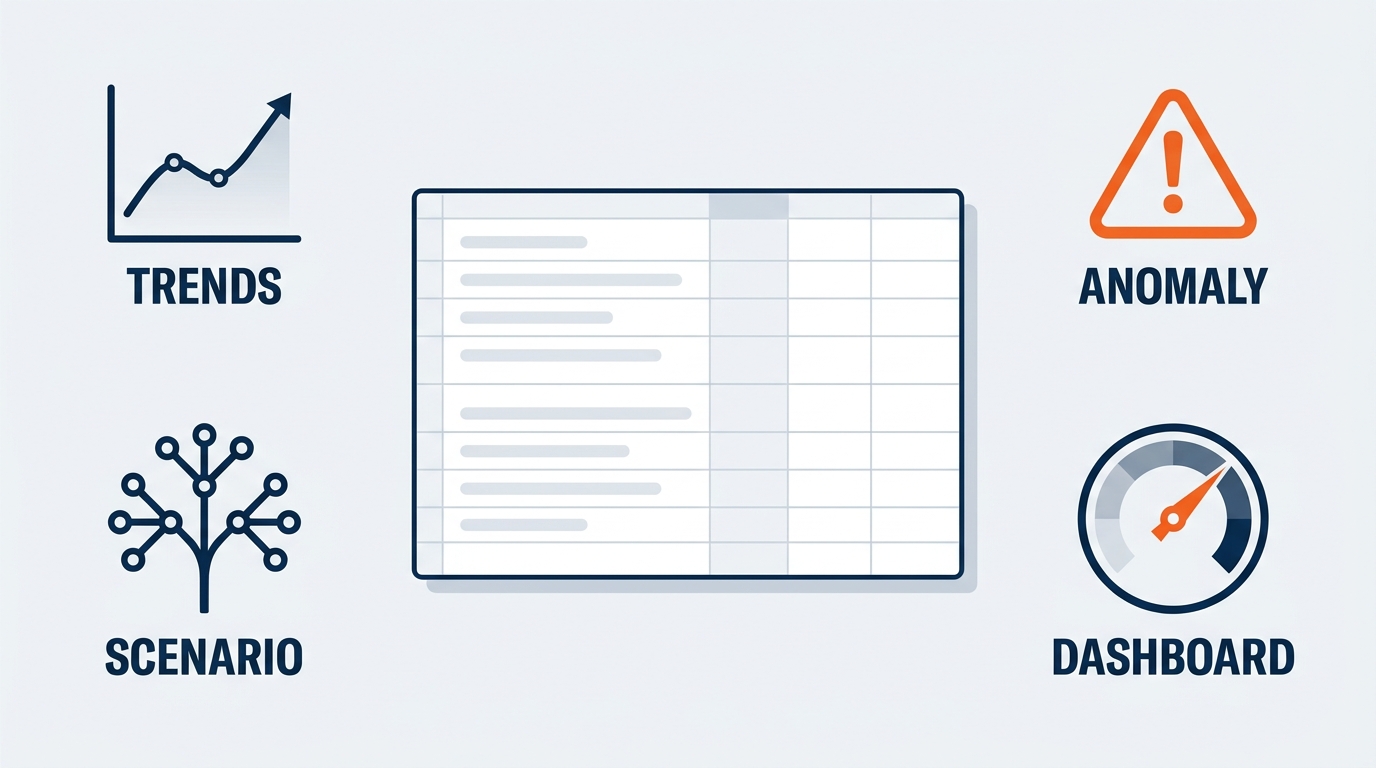
Figure 1:The six pillars of advanced Copilot-in-Excel mastery — each one represents the shift from answering a question to building an analytical system that runs every show cycle. This chapter maps the journey from power user to institutional asset.
“The goal is to turn data into information, and information into insight.” — Carly Fiorina
There is a frustration experienced exhibition professionals recognize immediately. It is not the frustration of not knowing how to do something. It is knowing exactly what needs to be done — the venue-move cost comparison, the drayage variance across the account’s six shows, the labor overtime picture by jurisdiction — and watching hours evaporate in mechanical execution while the actual thinking waits.
Chapter 7 resolved one layer of that. Formatting tables, generating formulas, building Pivot Tables from plain-English questions removed a large share of the mechanical overhead. This chapter operates at a different level.
The distinction between a casual Copilot user and a power user is not knowing more prompts. It is a shift in what you are building. A casual user asks Copilot questions. A power user builds analytical systems — templates that run the same rigorous analysis on every show without being rebuilt, anomaly workflows that flag a mis-billed drayage line before the exhibitor finds it, scenario models that answer “what happens to margin if this show moves from Las Vegas to Chicago” in an afternoon rather than a week.
At GES that shift is arithmetic, not preference. We produce 4,000+ live experiences a year across 75+ countries, serving 150,000+ exhibitors through 24 global production and warehouse facilities. The same analysis — freight target versus actual, forecast versus actual I&D hours, pre-show estimate versus reconciled margin — repeats thousands of times a year with a different show code on top. That repetition is exactly what justifies automation. A one-off analysis is worth doing well. An analysis that runs 4,000 times a year is worth engineering.
1.11. From Questions to Systems — What Advanced Looks Like
Watch two logistics analysts handle the same request: a monthly cross-show drayage and freight variance review the show operations director expects on the first Monday of every month.
The basic user pulls the reconciliation exports, formats each as a table, asks Copilot for a chart and a Pivot Table, adjusts by hand, pastes into a deck, sends it. Forty-five minutes. Next month, from scratch, again.
The advanced user built the analysis once: a defined input zone, validation checks that catch a missing venue or blank weight column before anything downstream breaks, formulas that recalculate the moment new data lands, a summary populating from one source table, and a documentation sheet so any analyst can run it. Each subsequent month takes eight minutes: paste, refresh, review, send.
The time saving is real but not the point. The point is institutional leverage. Errors get caught in design rather than discovered in month four. A coordinator who joined last week can run it on day one. And when the director asks the same question about a different portfolio, the answer is a copy of the workbook, not a new project.
Copilot is not the hero here. The analytical design is. But Copilot dramatically lowers the construction cost of that design — formula logic, outlier rules, scenario structure — work previously available only to people with deep Excel expertise, which in most show teams means one person, and they are busy.
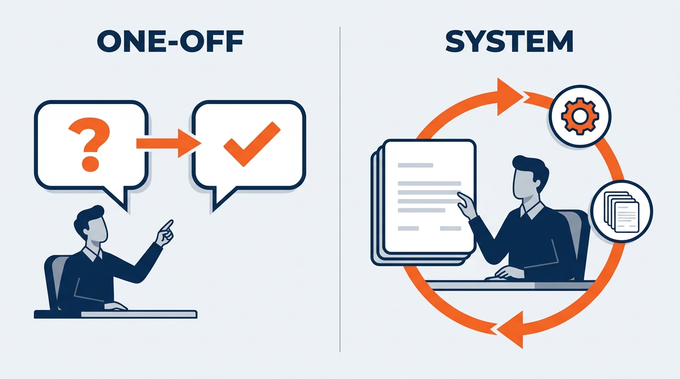
Figure 2:The basic user answers a question with Copilot. The advanced user uses Copilot to build a system that answers the same question every show cycle — more reliably, faster, and with less cognitive overhead.
The three hallmarks of an advanced Copilot user: Reproducibility — the logic is documented and anyone qualified can run it again and get the same answer. Scalability — the template works for every show at that venue, then every venue in the region, then the account’s full portfolio. Auditability — every formula is reviewed and validated before it produces a number that reaches an exhibitor invoice, an organizer settlement, or a leadership deck. The human is always the last check before output becomes decision.
1.22. Building Repeatable Analytical Templates
The most powerful thing you can do with Copilot in Excel is not ask a question. It is design a template — a structured workbook producing the same rigorous output every time, regardless of who runs it or which show it points at.
Consider the monthly freight and labor review. Every show operations director needs to know how shows performed against freight targets, how actual I&D hours landed against forecast, where overtime concentrated by jurisdiction, and which shows closed below their pre-show margin estimate. Historically that required a dedicated analyst, or an ops director building formula chains under deadline during move-in — when the question always arrives.
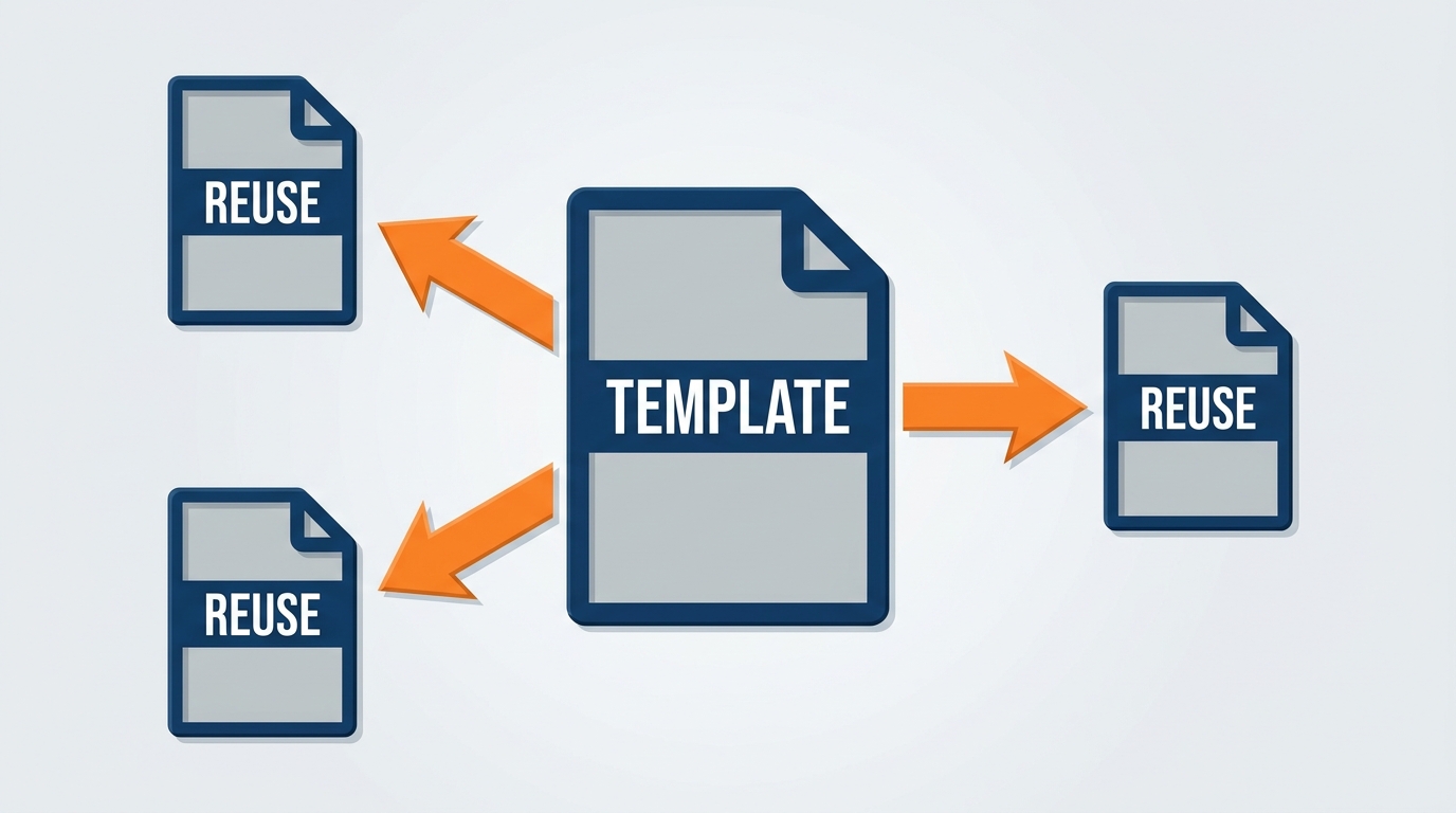
Figure 3:A well-designed template separates concerns across five layers. Copilot accelerates construction of Stages 2, 3, and 4 — the validation logic, formula chains, and summary architecture that previously required deep Excel expertise.
1.2.1Designing the Template Architecture
Step 1 — Define the input zone. One clean sheet where the raw export lands. Nothing else lives there. Headers must be identical across every export — the discipline Chapter 7 argued for: Inbound Weight (lbs), not Wt; I&D Straight Time Hours, not Hrs.
Step 2 — Build the validation layer.
“My input table has Show Code, Venue, Union Jurisdiction, Move-In Date, Net Booth Sq Ft, Inbound Weight (lbs), Material Handling Charge (USD), Freight Target (USD), Freight Actual (USD), I&D Forecast Hours, and I&D Actual Hours. Build validation formulas flagging any row with a missing venue or jurisdiction, any blank or zero weight where a material handling charge exists, any show appearing twice, and any freight actual more than three times target. Explain each formula before generating it.”
“Explain before generating” is not politeness. It is what keeps you in the loop on logic that will run unattended for a year.
Step 3 — Build the calculation engine.
“Add calculated columns for freight variance as a percentage of target, material handling charge per hundredweight, material handling charge per net square foot, I&D hour variance as a percentage of forecast, and overtime as a share of total labor hours. Explain each formula’s logic and tell me how each behaves if the denominator is zero.”
That last clause matters. A show with a zero freight target — which happens when the organizer absorbs freight — produces a divide-by-zero that cascades through every summary above it.
Step 4 — Create the summary layer. Have Copilot propose structure before you build: “What four or five views would give a show operations director the clearest picture of portfolio health in under 60 seconds? Suggest chart types and tell me what each is designed to reveal.”
Step 5 — Document it. What data to paste, where it comes from, what each output means, who to call when a number looks wrong. A template only you can run is a productivity tool. A template any analyst can run is an institutional asset — and at 4,000 shows a year, only the second kind matters.
1.33. Advanced Anomaly Detection
Chapter 7 introduced outlier detection as a question you can ask. This section treats it as a system you run.
The stakes are specific here. An anomalous material handling charge per hundredweight may be a legitimate uncrated-freight special handling charge, or a keying error that becomes an exhibitor dispute on the show floor during move-in — the least recoverable moment in the show cycle. Margin drifting down across three editions of the same show organizer’s event is almost never visible in one reconciliation and almost always visible across the series.
Copilot finds these patterns in seconds. What it cannot do is validate them, investigate them, or decide whether they are a real problem or a normal operating fact. That division of labor is the whole discipline.
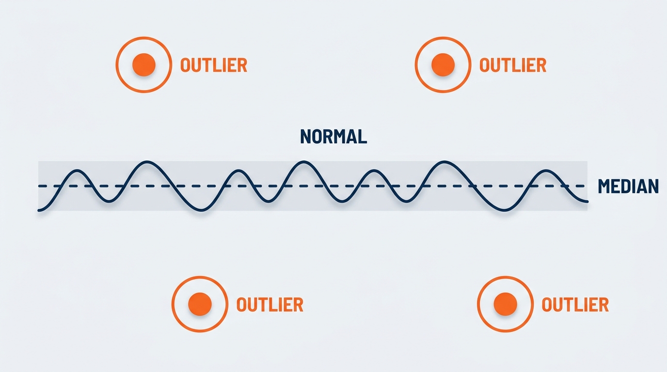
Figure 4:Anomaly detection is a three-stage process. Copilot handles Stage 1 with speed and consistency. Stages 2 and 3 — validation and investigation — require operational judgment Copilot does not have.
1.3.1What Questions to Ask
Vague questions produce vague flags. The useful pattern defines the comparison baseline, the threshold, and the output format in the prompt itself.
Drayage and material handling billing anomalies:
“Compare material handling charge per hundredweight for every shipment against the median for the same venue and the same shipment type. Flag any line more than two standard deviations from that median, sorted by dollar impact.”
The baseline is the design decision: same venue, same shipment type. A direct-to-show-floor shipment routed through a marshaling yard and an advance warehouse shipment at another venue are not comparable, and treating them as comparable flags thirty normal lines and buries the one real error.
Freight target variance outliers by venue:
“Calculate freight actual versus target as a percentage for every show. Group by venue and show which venues have a consistent overage pattern — more than half their shows over target — versus which have isolated outliers. Flag the shows driving each.”
That is a different question from “which shows blew their freight target.” A venue with a systematic pattern means the targets are wrong. A venue with one bad show means the show was unusual. Different owners, different actions — and only the grouped question distinguishes them.
Labor overtime spikes by jurisdiction and crew:
“Calculate overtime as a percentage of total I&D hours for each crew call. Compare each to the median for the same union jurisdiction and the same phase — move-in or move-out. Flag any call in the top decile for its jurisdiction and phase.”
Comparing within jurisdiction is essential. A jurisdiction whose straight-time window closes at 3:30pm produces a structurally higher overtime share than one running to 5:00pm. A portfolio-wide comparison ranks jurisdictions by their contracts rather than crews by their performance.
Margin erosion show-over-show:
“For every recurring show appearing three or more times, calculate reconciled gross margin percentage per edition and identify any where margin declined in each successive edition. Break out the change in revenue per net square foot, material handling revenue, and labor cost per net square foot so I can see which line is moving.”
This is the highest-value anomaly in the chapter and the hardest to see manually, because it is slow. Two points a year for three years is a six-point problem that never once triggered an alarm on a single reconciliation.
Exhibitor attach rate anomalies: flag any recurring show where attach rate dropped more than 5 points versus its prior edition — and, separately, any show above 70 percent attach but below the portfolio median on revenue per exhibitor. That second condition finds shows where exhibitors are buying but buying small: a pricing question, not an outreach question, and one no single-metric ranking surfaces.
1.3.2Validating What Copilot Flags
Every flag clears two gates. Data validation: tie the line to source — the invoice, the manifest, the crew call sheet, the receiving record. Export drift, a rebill posted to the wrong show code, or a pounds/kilograms mismatch manufactures convincing false positives all day. Operational validation: if the data is right, is the pattern explainable? A material handling spike at a heavy-equipment show where 12,000-pound crates are routine is normal. An overtime spike where the prior tenant ran long was probably escalated at the time. Checking context first protects the credibility you will need on the day a flag turns out to be real.
1.44. Scenario Modeling and Sensitivity Analysis
If one advanced Excel capability has historically required specialized software or a very senior analyst, it is scenario modeling. “What happens to margin if this show moves from Las Vegas to Chicago” sounds simple. Building the model that answers it — defensible assumptions, consistent logic, clear output — is laborious. Copilot cuts the construction time without cutting the rigor, provided you bring the right assumptions.
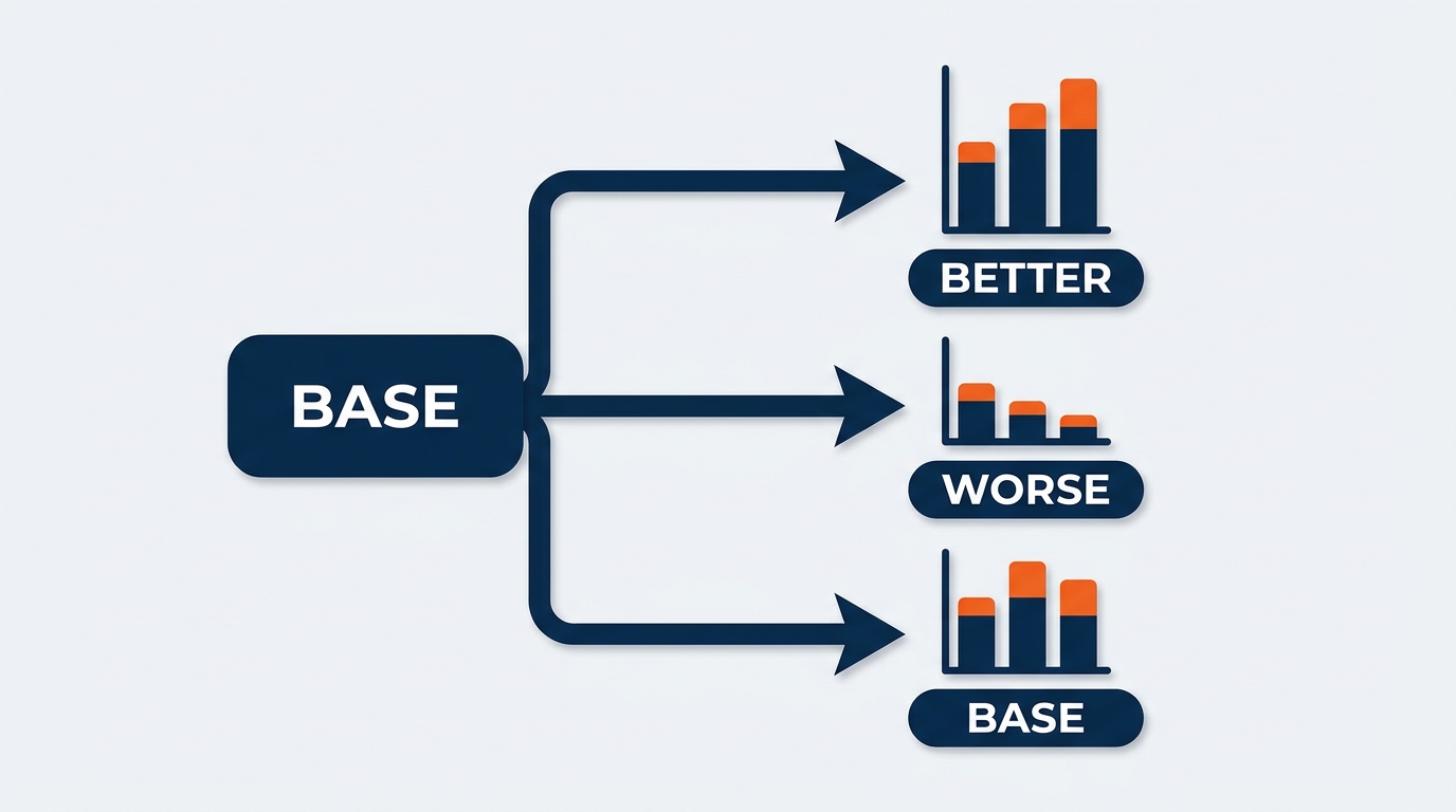
Figure 5:A well-structured scenario model presents clear alternatives with consistent assumptions across each. Copilot helps build the formula structure and the visualization — the assumptions themselves come from your operations team, the venue agreement, and the labor contract.
1.4.1The Venue Move Scenario
An account director asks: the organizer is considering moving a 250,000 net square foot show to a different city. What happens to our cost structure and our margin?
“Moving venues” is not a model input. The inputs are the union jurisdiction and its straight-time window, the rates under that agreement, the material handling tariff at the new facility, the drayage distance from advance warehouse to dock, the dock count and how it constrains move-in, and the freight lane costs to the new city. Every one is a real number in a real document, and Copilot cannot supply any of them.
So build the assumption layer first: one labeled table, a row per variable, a column per scenario, a source note per row. Every downstream formula reads from this table and nowhere else.
“My assumption table has rows for Union Straight Time Rate, Overtime Multiplier, Straight Time Window End, Material Handling Rate per 100 lbs, Advance Warehouse Storage Rate, Estimated Inbound Weight, Net Booth Square Footage, Move-In Days Available, and Available Dock Positions, with columns for Scenario A, B, and C. Build the calculation structure deriving total labor hours, overtime hours, total labor cost, total material handling cost, and total direct cost for each. Explain each formula and list every assumption the structure makes that I did not explicitly give you.”
That last sentence is the most valuable clause you can put in a scenario prompt. Copilot will make implicit assumptions — how crew size scales with square footage, whether overtime applies to all hours or only those beyond the threshold, whether storage is charged per day or per event. Enumerating them converts silent risk into a review checklist.
1.4.2The Move-In Compression Scenario
The most operationally interesting scenario in our business is time, not money. What happens if move-in compresses from five days to three?
“Using my assumption table, model the labor impact of reducing available move-in days from 5 to 3 while holding total required install work constant. Assume hours beyond the straight-time window in each remaining day are charged at the overtime multiplier. Show total, straight time, and overtime hours, overtime share, and total labor cost for both cases, plus the incremental cost of compression.”
Build this once and reuse it constantly, because the question recurs on nearly every show — a prior tenant runs long, a venue changes a hall release time, an organizer adds a sponsor build. Having the answer in ten minutes instead of a day decides whether the conversation with the organizer happens before the decision or after it.
1.4.3Sensitivity Analysis
A sensitivity table shows how the output moves as one input varies across a range — revealing which assumptions actually matter. “Build a sensitivity table showing total labor cost as overtime share varies from 10 percent to 60 percent in 10-point increments, holding total hours constant at the Scenario B value.”
Run the same structure on the inputs that drive the business: material handling rate against drayage revenue, attach rate against service revenue, pickup against attrition exposure. In most GES cost models two or three inputs explain nearly all the variance and the rest is noise. The sensitivity table tells you which is which — and therefore where to spend estimating effort on every future show.
1.4.4onPeak Pickup Forecasting and Attrition Risk
Housing is a forecasting problem with a contractual cliff at the end of it — an ideal modeling target.
“Using the historical pickup curves in this table — cumulative room nights booked by week out from show date for the last eight editions — build a projected pickup curve for the current show based on bookings to date, and calculate projected final pickup as a percentage of the contracted block. Then calculate attrition exposure in dollars at the contracted threshold for projected pickup, projected minus 10 points, and projected minus 20 points.”
Then the strategic version: “Across all eight editions, is the booking window compressing — are bookings arriving later relative to show date each year?” If the curve is compressing across the portfolio, that changes how blocks are sized and when attrition is renegotiated — invisible in any one show, unmistakable across thirty.
1.55. Copilot Cowork — Automating the Analysis That Repeats
Everything so far describes Copilot working inside a workbook you have open, on a task you initiated. That is the right model for building a template. It is the wrong model for running one 4,000 times a year.
This is the natural home of Microsoft 365 Copilot Cowork, generally available worldwide since June 16, 2026. Chapter 7 introduced it for analysis spanning more than one file. Here we use it for analysis that repeats on a schedule or fires on an event — Cowork supports both. And because it runs in a hosted, sandboxed cloud environment, work proceeds whether or not your laptop is open, which for a workforce that lives on show floors is not a footnote. It is the entire proposition.
1.5.1The Monthly Cross-Show Drayage Variance Report
The template from Section 2 produces the analysis. Cowork runs it without you.
Outcome: A monthly cross-show drayage and material handling variance report covering every show that closed in the prior calendar month.
Inputs: The reconciliation files in the SharePoint library Show Reconciliation FY26, the venue and jurisdiction attributes in Ops Reference Data.xlsx, and the rate reference sheet in Tariff Reference — Current.xlsx.
Definition of done: One workbook saved to the Monthly Analytics folder, named with the reporting month, with labeled tabs — Summary, Cost per CWT by Venue, Advance Warehouse vs. Direct Split, Freight Target Variance by Show, Flagged Lines, and Source Notes listing every file used and the date pulled. Plus a Teams post in Logistics Analytics with a five-bullet summary and a link.
Constraints: Use only rates present in the rate reference sheet — do not infer, estimate, or supply any rate not found there. If the reference sheet’s effective date predates any show’s move-in date, flag it on the Summary tab and skip per-unit costs for that show. Flag missing fields rather than filling gaps.
Approval scope: Ask before posting to Teams. Do not email anyone.
Schedule: The third business day of each month.
That is the five-part structure Microsoft recommends — outcome, inputs, definition of done, constraints, approval scope — with a schedule attached. Notice how much of it is constraints. That ratio is correct. When a human runs an analysis, judgment fills the gaps in the instructions. When a scheduled task runs at 6am on the third while you are in a dock meeting, the constraints are the judgment.
1.5.2The Event-Driven Post-Show Reconciliation
The more powerful pattern fires on an event rather than a date. A show closes. The final labor actuals file posts to the show’s SharePoint library. That posting is the trigger.
The outcome is a post-show reconciliation package. The inputs are the freight manifest, labor actuals, exhibitor order extract, and pre-show estimate, all in that library. Done means an Excel workbook with a margin bridge from pre-show estimate to reconciled actual, a variance tab isolating freight, labor, and service revenue contributions, and an exceptions tab listing every line that failed validation — plus a one-page Word summary for the account director and a draft email to the show team, held for review, not sent. The constraints carry the weight: rates come only from the show’s exhibitor service kit and the applicable labor agreement, both in the folder; do not contact the organizer or any exhibitor; if a crew call is missing a jurisdiction, flag it rather than inferring it from the venue. Approval scope: ask before sending anything or sharing outside the show team.
The value here is timing, not effort. A reconciliation that starts the moment the last file lands — rather than when an analyst has a free afternoon — closes days earlier. Across a 4,000-show calendar, that is a materially different reporting position.
Table 1:Recurring GES Analyses Worth Automating with Cowork
Analysis | Trigger | Persona | Why It Justifies Automation |
|---|---|---|---|
Cross-show drayage variance report | Monthly schedule | Logistics analyst | Same analysis, new shows, every month, forever |
Post-show reconciliation package | Final labor file posts | Finance analyst | Fires 4,000+ times a year; timing beats effort |
onPeak pickup and attrition exposure review | Weekly schedule | onPeak analyst | Attrition deadlines move; exposure must be current |
Labor overtime exception report | Weekly schedule | Show operations director | Catches compression while the show is still live |
Account portfolio roll-up | Monthly schedule | Account director | Multi-show, multi-file, always needed before the QBR |
Cost per square foot benchmark | Quarterly schedule | Finance analyst | 24 facilities is beyond manual comparison |
ESG emissions and diversion pack | Quarterly schedule | Sustainability lead | Cadence is fixed and externally committed |
Two of those entries deserve a note, because they are effectively impossible by hand and routine once automated. Cost per square foot benchmarking across 24 facilities — direct cost per net square foot for every show at every facility over 24 months, split into material handling, labor, and other, normalized for show size band, and ranked with each facility’s own trend alongside. Nobody was ever going to build that for a Tuesday planning meeting, and the output separates which venues are structurally expensive from which shows were run expensively. And ESG trend modeling — emissions per net square foot and per exhibitor, reuse rate on structural stand components, waste diverted from landfill, normalized by region. GES EMEA’s data-led emissions reporting and the Roadmap to Net Zero are exactly the externally committed, fixed-cadence reporting where a scheduled job pays for itself immediately.
1.66. Python in Excel — The Expanding Frontier
Python in Excel brings Python computation directly into Excel worksheets. Instead of a formula, you write Python in a cell and it executes with access to pandas, matplotlib, and scikit-learn, running in a secure Microsoft cloud environment rather than on your machine — which is what makes it viable in an enterprise tenant.
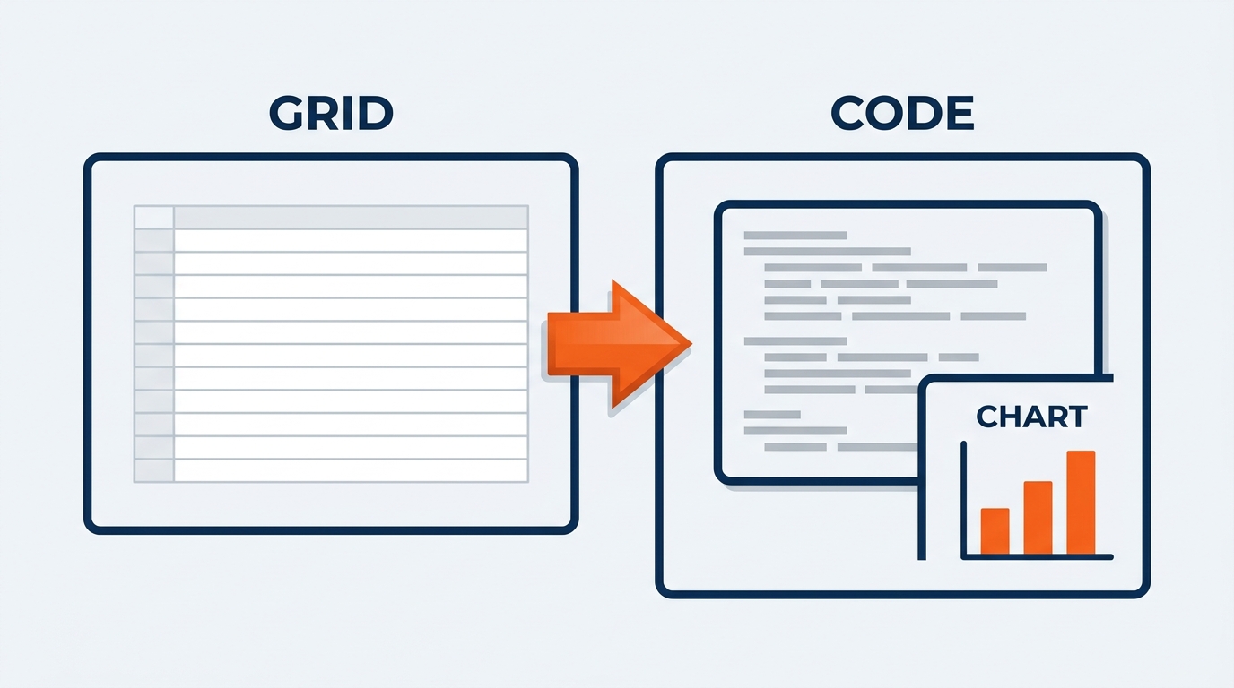
Figure 6:Python in Excel removes the separation between spreadsheet analysis and data science computation. Python executes directly in the worksheet, with outputs rendered as values, charts, or tables that integrate with the rest of the workbook.
Current status, stated precisely. Python in Excel is generally available across commercial Microsoft 365 subscriptions. Copilot’s ability to write Python inside Excel is expanding but is not confirmed as generally available as of this writing — in some tenant configurations you can ask Copilot to suggest Python for a cell; in others you cannot. Check your GES tenant before building a workflow that depends on it. What is confirmed: Copilot and Python work side by side — Copilot for formula design, Python cells for computation native formulas handle badly.
What it enables: pandas joins a freight manifest, a labor file, and an order extract with mismatched keys and dates far more gracefully than nested lookup chains. scipy.stats supports significance testing, which matters when deciding whether a jurisdiction’s overtime share is genuinely different or just noisy across a handful of shows. And predicting labor hours from show characteristics — square footage, exhibitor count, exhibit profile, venue — is a regression problem, which is where Python earns its place.
For most GES professionals this is a capability to leverage with analytics or IT colleagues. For those with a Python background, it removes the round trip between the analytical environment and the reporting environment leadership reads.
1.77. Natural Language to Complex Formula
Chapter 7 covered formula generation at a foundational level — SUMIFS, XLOOKUP, basic nested logic. Advanced work requires more, and Copilot scales when the prompt is specific. The key insight: Copilot does not just generate formulas, it explains them. When it produces a nested condition chain with six paths, the explanation is the only practical way to assess whether the logic matches your intent.
Figure 7:Five advanced Excel formulas Copilot can generate for exhibition analytics — each representing complexity that previously required dedicated formula expertise to build correctly.
1.7.1Tiered Classification with Nested Logic
Classifying show performance means applying threshold rules across several dimensions at once — important to get right, painful to build by hand.
“Create a ‘Show Risk Tier’ column. ‘Critical’ if actual I&D hours exceed forecast by more than 25 percent OR freight actual exceeds target by more than 20 percent. ‘Watch’ if either exceeds by 10 to 25 percent, or overtime share is above 35 percent. ‘On Plan’ if both are within plus or minus 10 percent and overtime share is at or below 35 percent. ‘Under’ if both are more than 10 percent below plan. Use IFS, explain each layer, and list every combination of inputs that would not be caught by any of these rules.”
That final clause is the professional move. Nested classification fails at the combinations you did not think about — a show 30 percent over on labor and 15 percent under on freight. Enumerating the uncovered cases turns a hidden gap into a design decision.
1.7.2XLOOKUP for Attribute Joining
Every operational file needs venue, jurisdiction, facility, and region attributes joined on before analysis is meaningful. Ask for XLOOKUP formulas pulling those attributes from a Venue Reference table onto the show file, matched on Show Code — and specify that a missing code returns 'Unmapped' rather than an error, plus a count of unmapped rows.
That unmapped count is the point. A join that silently drops eleven shows produces a portfolio analysis confidently missing eleven shows.
1.7.3Dynamic Arrays and the LET Function
FILTER, SORT, UNIQUE, and SEQUENCE resize themselves as data changes — essential in a template pointed at a different number of shows every month. “Write a formula extracting every show at the venue named in cell B2 where freight variance exceeds 15 percent, sorted by dollar variance descending. The output must resize automatically as shows are added or removed, and display ‘No shows above threshold’ rather than an error when nothing qualifies.”
For any calculation with intermediate steps, LET names those steps — converting an unreadable formula into one a colleague can audit.
“Build a Show Health Score combining three weighted factors: labor hour variance versus forecast at 40 percent, freight variance versus target at 35 percent, and margin variance versus pre-show estimate at 25 percent. Use LET to create a named intermediate for each, normalize each to a 0–100 scale, then combine into a final score.”
1.88. Portfolio Dashboards for Show Leadership
A dashboard is not a collection of charts. It is a curated information experience — the most important signals surfacing immediately, supporting context one layer deeper, and the viewer leaving knowing where performance stands and where attention is needed. Copilot accelerates construction. The curation is yours.
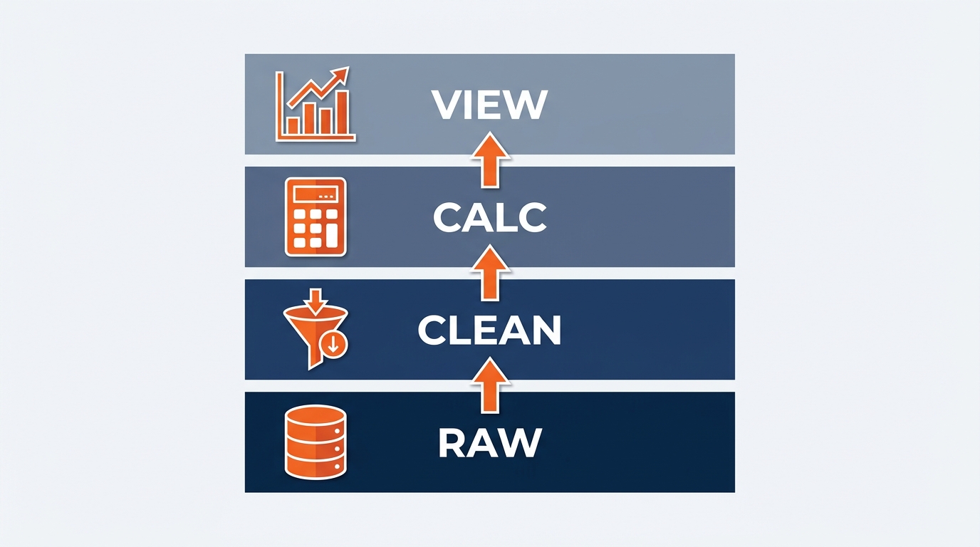
Figure 8:A three-layer dashboard separates executive summary from operational detail from raw data — each layer serving a different audience and depth. Copilot helps build all three; deciding what belongs in each layer requires business judgment.
What Copilot can do. Propose the structure before you build:
“I am building a monthly show portfolio dashboard for a show operations director. The data includes show code, venue, union jurisdiction, net booth square footage, material handling charge, freight target and actual, I&D forecast and actual hours, overtime hours, exhibitor count, exhibitors ordering services, service revenue, and reconciled margin. What four KPIs belong in an executive summary, what supporting visuals belong in an operational view, and what detail layer supports investigation? For each, state what decision it is meant to support.”
Then generate each visual by description: “Create a clustered bar chart of cost per net square foot by venue, with a horizontal reference line at the portfolio average, sorted descending.”
What humans must do. Validate every number — a dashboard built from an export with a formula error propagates it to every card and chart, and a dashboard is the most trusted artifact in the building precisely because it looks resolved. Curate ruthlessly — fourteen charts do not communicate, they overwhelm; the hardest skill in dashboard design is deciding what to leave out. Interpret — a dashboard shows what; a professional explains why, so what, and now what. Copilot can draft the commentary. What it means for the account, the venue relationship, or next year’s targets is yours.
1.99. The Verification Discipline in Advanced Analytics
Chapter 7 introduced verification as a safeguard: check formulas, spot-check chart data. At the advanced level the stakes change. A venue-move model shapes where an organizer holds a show. A margin erosion finding triggers a pricing conversation on a decades-old account. A scheduled anomaly report decides whether an exhibitor gets a billing adjustment. Complexity raises consequences, and consequences demand proportional rigor.
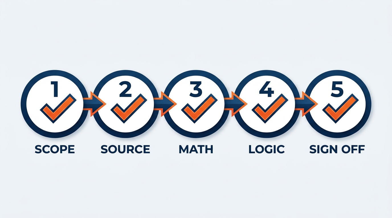
Figure 9:The Five-Step Review Protocol scales to any complexity level. Apply all five to any Copilot-assisted model before it informs a leadership decision or reaches a customer.
Step 1 — Logic Review. Read every formula and ask whether it does exactly what you intended. For complex conditions, trace one example row by hand. Verify the edge cases you know exist — the show with a zero freight target, the crew call with no jurisdiction, the international show priced in a second currency.
Step 2 — Assumption Audit. Ask directly: “What assumptions did you make that I did not specify?” Common ones: how ties break in rankings, what happens when a lookup misses, whether percentages use absolute or relative denominators, whether a multiplier applies to all hours or only those beyond a threshold. Every implicit assumption is a potential error with no error message attached.
Step 3 — Boundary Test. What does the risk tier formula output for a show exactly 25 percent over forecast — the boundary between “Watch” and “Critical”? Boundary behavior reveals whether the logic is right for all inputs or only typical ones.
Step 4 — Source Verification. For anything informing a decision or reaching a customer, tie at least three figures to source: an invoice line, a manifest entry, a crew call sheet, a published tariff. Any discrepancy gets investigated before you proceed. The formula might be wrong; the export might be wrong. Either way you need to know before someone else finds out.
Step 5 — Peer Review. For any model reaching an organizer, an executive, or a settlement conversation, have a qualified colleague review methodology and key outputs first. Not a reflection on your competence — the standard for analysis that drives material decisions.
1.1010. Building the GES Analytics Playbook
Individual capability is valuable. Institutional capability is transformational. The difference between one analyst who is excellent at Copilot-assisted Excel and a GES analytics culture is documentation — capturing templates, prompts, assignments, and protocols so any qualified professional can operate at a level that currently requires one specific person.
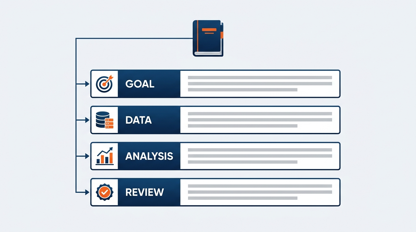
Figure 10:A well-structured playbook converts individual expertise into institutional capability. Each section addresses a distinct failure mode — missing templates, weak prompts, skipped verification, inconsistent data, and unclear escalation.
Standard Templates — validated workbooks for the analyses that run on a cadence: monthly cross-show drayage variance, per-show reconciliation, quarterly cost-per-square-foot benchmark, weekly onPeak pickup and attrition review, the venue-move and compression models. Each documented for inputs, outputs, and meaning.
Proven Prompt and Assignment Library — prompts and Cowork assignments that have produced reliable, validated outputs, organized by analysis type, each recording the context it assumes and its known limitations. The Cowork assignments matter most: a five-part assignment with tested constraints is a genuine asset, and rewriting one from memory every quarter is exactly the waste this chapter exists to eliminate.
Verification Protocols by Stakes Level — three tiers: lightweight (internal), standard (shared with management), rigorous (organizer-facing, settlement, or externally reported ESG figures). Prevents both under-verification of high-stakes outputs and over-verification that slows routine work to a crawl.
Data Standards — column naming with units spelled out, required structure, source documentation, currency normalization for international shows, known quality issues in common exports. Prevents the failure mode where the formula is right and the input is wrong.
Escalation Guidelines — what a flagged anomaly requires, from whom, through what channel. Prevents under-escalation of real findings and the credibility damage of escalating routine variation.
How to build it. Not in a day — in the course of the work. Each time you build a template, record it. Each time an assumption audit surfaces something Copilot assumed silently, add it to the checklist. Each time a flagged anomaly turns out to be normal, document the distinguishing feature so nobody investigates it twice.
The playbook is the institutional return on every hour invested here. It means the analysis does not live in one person’s head or one person’s laptop. It lives in the company — which, since December 31, 2024, when GES completed its separation from Viad under Truelink Capital and became independent for the first time in 55 years, is a company that sets its own standard. Nobody else defines what good looks like here. That is a responsibility and an opportunity in the same sentence.
1.11🧪 Try This — Build a Move-In Compression Model
Build a scenario model in Excel using Copilot, then apply the full review protocol before trusting a single output.
1.12Glossary
Analytical Template A pre-built, validated workbook that produces consistent output when given new input data, letting any qualified user run the same rigorous analysis without rebuilding it.
Anomaly Detection Identifying data points that deviate significantly from expected patterns — at GES, unusual material handling charges, freight overages, overtime spikes, and margin erosion.
Copilot Cowork Microsoft 365 Copilot’s delegated-work experience, generally available June 16, 2026. Executes long-running, multi-step, multi-file tasks in a hosted cloud environment and returns finished artifacts. Supports scheduled prompts and event-driven tasks, and keeps working while your device is off.
Cost per Net Square Foot Total direct cost divided by net booth square footage — the primary normalization metric for comparing shows of different sizes and benchmarking across facilities.
Event-Driven Task A Cowork pattern that runs when something happens — a file posting, an email arriving — rather than on a fixed schedule. The natural trigger for post-show reconciliation.
LET Function An Excel function that names intermediate calculations within a formula, making complex logic readable and auditable — essential for any composite score a colleague must review.
Margin Erosion A sustained decline in reconciled gross margin across successive editions of the same recurring show. Rarely visible in one reconciliation; reliably visible across a series.
Move-In Compression A reduction in the available move-in window without a matching reduction in required install work — the most common and most costly scenario modeled in show operations, driven primarily by overtime.
Python in Excel A Microsoft 365 feature allowing Python to execute directly within Excel worksheets, accessing pandas, matplotlib, and scikit-learn, running in a secure Microsoft cloud environment.
Rate Sheet Rule The GES discipline that Copilot may perform arithmetic on rates but must never supply them. Drayage tariffs, union hourly rates, and venue charges come from the published tariff, exhibitor service kit, or labor agreement — never from a generated answer.
Scenario Modeling Evaluating outcomes under multiple defined future states — at GES, venue changes, move-in compression, crew sizing, and portfolio planning.
Scheduled Prompt A Cowork pattern that runs a defined assignment on a recurring cadence, producing finished artifacts without a human initiating each run.
Sensitivity Analysis Showing how an output changes as a single input is systematically varied, revealing which assumptions actually drive the result and which are noise.
Union Jurisdiction The labor agreement and work rules governing a venue or city — trades, rates, and the straight-time window. The correct comparison baseline for any labor anomaly analysis.
1.13Discussion
Using Copilot as a system-building accelerator rather than a question-answering tool changes how analytics creates value at GES. Instead of one-off analyses living in individual inboxes, advanced workflows build infrastructure that scales across 4,000+ events a year, 24 facilities, and the full GES Collective — GES Exhibitions, Spiro, onPeak, SHOWTECH, and Visit by GES.
Consider the analyses you produce regularly. Which are genuinely the same analysis with a different show code on top? What would it take to turn one into a template, then into a scheduled Cowork assignment? And what would have to be true about your verification discipline before you would let it run without you?
1.14Leader’s Takeaway
Advanced Copilot in Excel changes the role of analysis at GES. When a venue-move model takes two hours instead of two days, and a monthly variance report runs on a schedule instead of an analyst’s Tuesday, the question is no longer whether to do the analysis. It is whether the culture has the discipline to do it well at that speed and volume.
The leaders who extract the most will invest equally in two things: the technical infrastructure — templates, prompt and assignment libraries, verification protocols, data standards — and the culture that makes it safe: rigorous review as habit, assumptions that carry a source and a date, and the absolute non-negotiability of the Rate Sheet Rule.
Automation multiplies whatever you built. Build carefully, verify deliberately, audit on a cadence — because a wrong number produced once is an incident, and a wrong number produced on a schedule is a policy.
Copilot makes analytical systems easier to build. The verification discipline, the playbook, and the operational judgment that reads a variance and knows whether it means a crew worked late or a rate was misapplied remain irreducibly human. Speed without rigor is acceleration toward error. Rigor enabled by speed is competitive advantage.
The goal, as always, is not to automate judgment. It is to give judgment better raw material — and more time to actually exercise it.